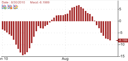
How to create histogram charts
Updated on 2012-02-24 03:38:32
|
First, we will add a simple indicator then we will transform the line chart into a bar or histogram chart.
Steps:
- Create a new pane by right clicking on a chart then selecting "Create new pane"
- In the new pane, add a new indicator (Example: Moving Average or MACD). For more info regarding how to add a technical analysis indicator to a chart, read the following how-to article: How to add a trading indicator to a chart
- Click on the third icon (at the top of your pane) or right click on the chart, select "Update formula dynamically" then select the formula you have just added (The formula that calculates and plots your indicator).
- In the new popup, select the "Plot" tab
- Update the "chart type" property and set it to "ChartBar"
You have just created your first histogram chart.
If you analyze the formula behind the graph you will see that changing a line chart to a bar chart, simply involves changing the forth parameter of the "Plot" function.

a = Macd(); // Calculates the Moving Average Convergence-Divergence or MACD of a stock
Plot(a, "Macd", colorBlack, ChartBar, StyleSymbolNone);
The above instruction plots a histogram of the MACD indicator while the following one plots a line:
Plot(a, "Macd", colorBlack, ChartLine, StyleSymbolNone);
|