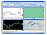
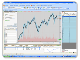
 Traders must know that the trend is your friend. There are three types of trends primary, intermediate and short term. With different time frames, a certain stock can have trends at odds with each other. How to track time frames A longer time frame gives some good indication about a stocks movement as opposed to shorter time frames, which contain a lot of noise and false moves. The primary trend is identified in the longer time frame and then a selected time frame by the trader is used to define the intermediate trend. Then a much shorter time frame will define the short-term trend. Different types of traders will have their preferred time frames. Long-term position trader: Primary trend will be recognized with monthly charts and the daily charts can be used to identify the short-term trend. Swing trader: These investors examine daily charts when making their investment decisions. The primary trend here is defined by the weekly charts and the short-term trend is defined by 60-minute chart patterns. Day trader: These traders are working with the shortest time frames by trading off 15-minute chart patterns. Here, 60-minute chart patterns identify the primary trend for the day trader and shorter trading time frames of 5 minutes define the short-term trend. As you can see, trading time frames are distinctive to each trader. One thing a trader must keep in mind is that short-term charts are perfect for narrowing down the entry and exit points. There is noise in a short-term chart that can distract a trader and if you want to be more profitable, it is important to remember that these short trading time frames only confirm or dismiss an assumption of the primary chart. Different Trading Time Frames Monthly Chart - Traders will quickly identify a longer-term trend with this stock chart. If we take Google (NASDAQ: GOOG) as an example stock to observe, we see that it is in an uptrend. Investors are bullish about this stock after looking at the chart and they will look to buy. Swing traders who are looking to hold for a few days don't need to go back too many years with this chart. Weekly Chart This chart can be used to define longer-term trends too especially with intra day traders. Buy and sell decisions by institutional investors are executed after scrutinizing the weekly chart. In this chart, a trader can look at data over two or three years. For Google, it seems likely that the current price of $758.87 is a good buy and a price target to sell could be anywhere at or above $775 a share. Daily Chart- It is vital that the daily chart is observed with data about stock movement over a period of half a year or more. There has to be sufficient data to identify points of support and resistance. A trading day is represented by one candle. When swing traders and day traders are looking at this chart when trading Google, they should look to make the chart as big as possible and fill up the whole screen. For a binocular view and to identify a precise entry point, a 60-minute chart does the trick. 60-minute chart - This offers a close examination of the individual candles that were on the daily chart. Each candle here signifies an hour of trading. Traders who are mostly involved with day trading will be looking closely for trend line breaks in Google's stock chart pattern. 5-minute chart - Yes! There is even a 5-minute chart that offers a microscopic view. Traders have now already decided to buy Google and are looking for the stock pull back to a support area to identify the entry price for them. There is an option of a 15-minute chart too which can be used instead of the 5-minute one. Trade Example I was watching Jim Cramer on his CNBC TV show Mad Money where he showed a trading strategy for Apple (NYSE: AAPL) that will work in the short-term and the long-term. The idea was to buy Apple at its 50-day moving average because this was its former breakout level. On October 2, Apple got mighty close to this 50-day MA and it setup an opportunity for swing traders. Additionally, day traders with a long position on the stock would have profited as well. Apples stock patterns in its 5-minute chart and 60-minute chart helped refine entry and exit points for both swing traders and day traders. Key Takeaways Traders can be successful in stock market trading if they properly examine multiple trading time frames. The main point on why looking at multiple trading time frames works is that it boosts an investors confidence and enables him or her to gain a better understanding of a stocks trend. Still, new traders will get confused with the dissimilar information that is shown in the different trading frames. In this case, it is best to stick with a couple of time frames such as the monthly chart and the daily chart. Even here, it must be noted that a stock can look bad on a daily chart, but amazing on a monthly chart. Each time frame will actually have an effect on the next one. A news flash on a stock will have an impact on the 5-minute chart, which shapes the 60-minute chart. This in turn influences the daily chart, which affects the weekly chart and then the monthly chart. The thing to keep in mind when trading with multiple time frames is to first pick a main time period. The next step is to examine a time frame greater than it and one that is less than it. The shortest time frame will give you an idea of where the stock is right now and the longest one gives you a heads up on where it will be headed. comments powered by Disqus |

|
|
|
|


