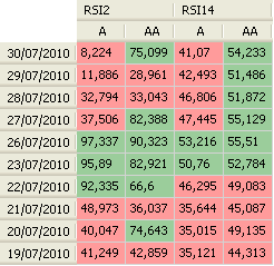
In this tutorial we will show you how to use the pivot table plug-in to display two relative strength index or RSI technical analysis indicators with different lookback periods of a list of stocks and for the last 10 trading days. The final result will look like this:  To create a pivot table, you will have first to create a dashboard. Select "Tools" then "New Dashboard", type a name then click on "Save". On this new dashboard, use your mouse to right click and select "Create Pivot Table". As you can see from the above picture, the rows contain the dates and the columns the stocks and the RSI values. To open the main control of the pivot table, right click on the table then click on "Update Rows/Columns/Values". This control lets you manage your columns, rows and values. Given the above example, the dates are associated with rows and therefore you will have to create a new row then select the date tab. The stocks or symbols are associated with columns and therefore you will have to create a new column and then select the symbols tab. In this tab, click on "Add Symbols", specify your own symbols' filter, then click on OK. The selected stocks will be displayed in columns. Now, the most important part of a pivot table is its values. A value header can be displayed as columns (default) or rows. The Value field defines the formula that will be used to calculate the values that will displayed on the pivot table cells. Because we want to display two different relative strength index indicators, we will have to create two Value Fields. Click twice and the plus button, then select the first item. In the Name field, type "RSI 2" and in the formula type: rsi(2). In this example, we are using both symbols and dates as columns and rows. Consequently, the summarize field is not important because there is only one RSI instance for a symbol-date pair. Under date panel, select "Last" and type 10 next to "Days". For the second Value field, type "RSI 14" as name and rsi(14) as formula. Update date settings; these settings are the same for the first and second fields. Click on OK to save settings. To start the calculation and analysis process, right click on the pivot table then select "Perform Calculation". In the image above, we have specified two conditional color rules. To specify these rules, right click on a chart and select "Update Table Settings". The background color of the cell will be painted in red if the relative strength index value is lower or equal to 50 and in green if RSI value is higher than 50. NB: - You can change dates order by right clicking on the table, clicking on "Update Table Settings" then selecting "Ascending Sort for Dates". - Value headers (Relative Strength Index) can be displayed in rows instead of columns. To do this, open the table settings and uncheck "Display multiple values in columns". - After each update, you should restart the calculation process.
|

|
|
|
|


