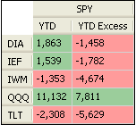
In this blog post, we will show you how to create a table that displays year-to-date excess return of several assets versus a specific benchmark. For this, we are going to use a powerful tool in QuantShare called pivot tables. First we need to create a dashboard then add a pivot table in it. To do this, select "Tools -> Dashboard -> New Dashboard" Give a name to your dashboard then click on "Save" A dashboard is a panel where you can add shortcuts (of your trading items), widgets and pivot tables. Right click on the dashboard then select "Create Pivot Table". A new black rectangle should be added to your dashboard. That rectangle is the container of the table we are going to create. At the top, you can see few icons. The first can be used to delete the pivot table while the second one is used to move the pivot table. At the bottom (right corner), you can resize the pivot table container. This tool is not very different from the Excel pivot table. Pivot Table Settings The next step would be to specify the row, column and value to display in the pivot table. Right click on the black rectangle then select "update Rows/Columns/Values". We want the table to look like this:  Notice in the above picture that each row contains a different asset symbol. Click on the "+" icon next to "Rows" to create a "Symbols" row. Under the "Symbols" tab type in the ticker symbols that will be displayed as rows. As an example, you can type the following ETFs: DIA IEF IWM QQQ TLT Now, click on "+" next to "Columns". We must have the benchmark symbol as column here. So, type one or several benchmark symbols here. Example: SPY Click on "+" next to values and input the following values: Name: YTD Dates: "Last Historical Quotes Date" (We will use the last bar's date for the calculation) Time frame: Daily Summarize: Last Value (We want to get only the last value) Formula: ((close / (valuewhen(year() != ref(year(), 1), ref(close, 1)))) - 1)*100 The above formula calculates the year to date return. You can plot it on a chart to see the corresponding time-series. Click again on "+" next to values to create the excess column: Name: YTD Excess Dates: "Last Historical Quotes Date" Time frame: Daily Summarize: Last Value Formula: ((close / (valuewhen(year() != ref(year(), 1), ref(close, 1)))) - 1)*100-((SYMBOL / (valuewhen(year() != ref(year(), 1), ref(SYMBOL, 1)))) - 1)*100 The above formula calculates the year to date return of an asset specified in "Rows" then subtract the year to date return of the benchmark asset specified in "Columns". Note how we reference the column's asset using the "SYMBOL" keyword. QuantShare will replace "SYMBOL" by the close price of the column's asset. NB: The pivot table we just created here can be downloaded directly from the sharing server: Year to Date Excess Return Using pivot tables, you can create so many things. Here are some examples: Create a Pivot Table that displays the Relative Strength Index - RSI How to display the number of stocks per day for different RSI groups How to create a correlation matrix of several securities Pivot Tables in QuantShare Trading Software
|

|
|
|
|


